EPUB
Create a simple visual pattern so the team could reshape.
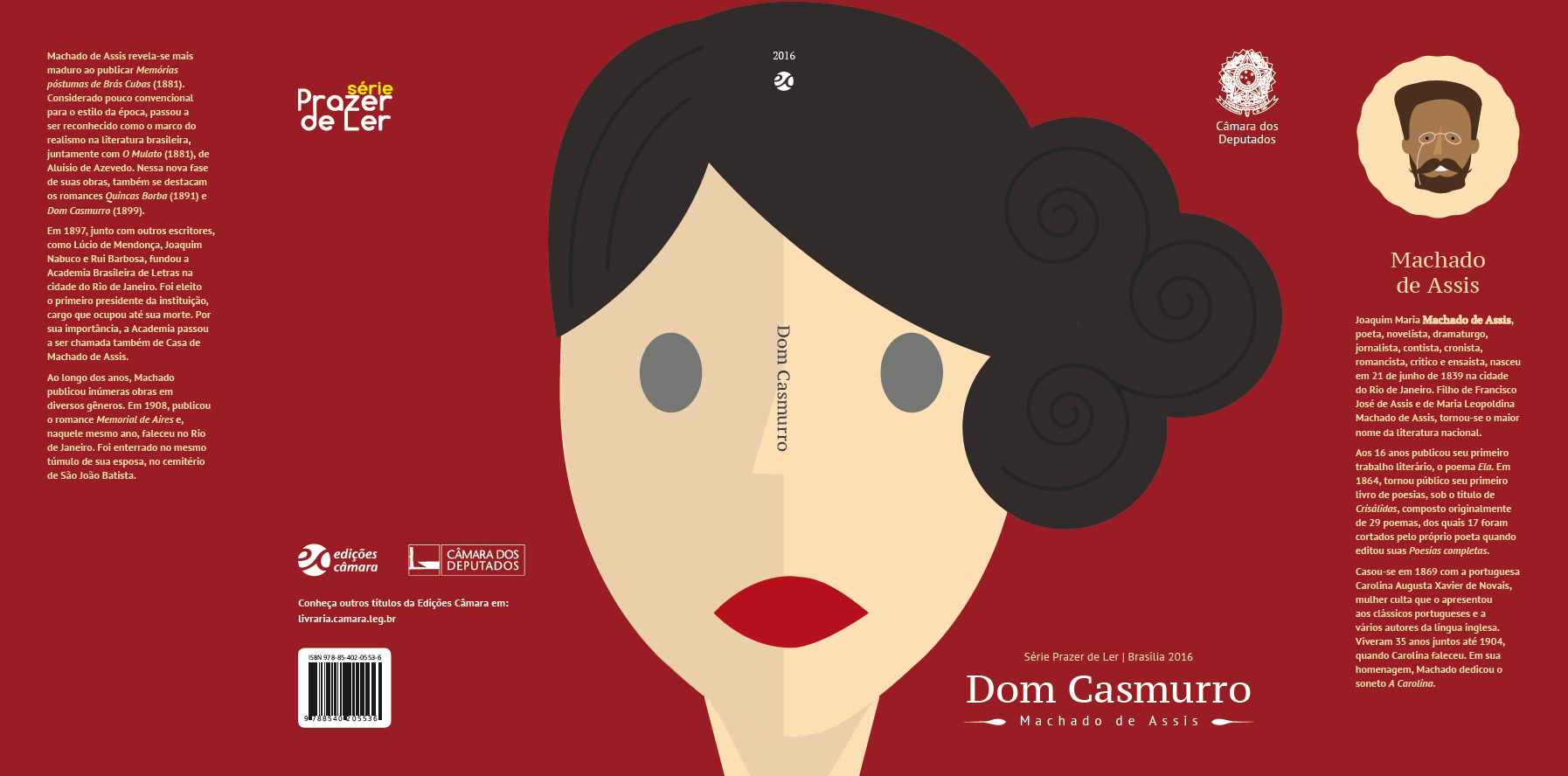
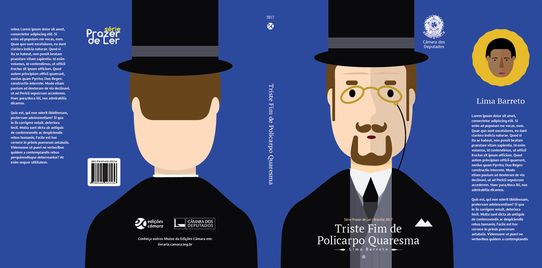
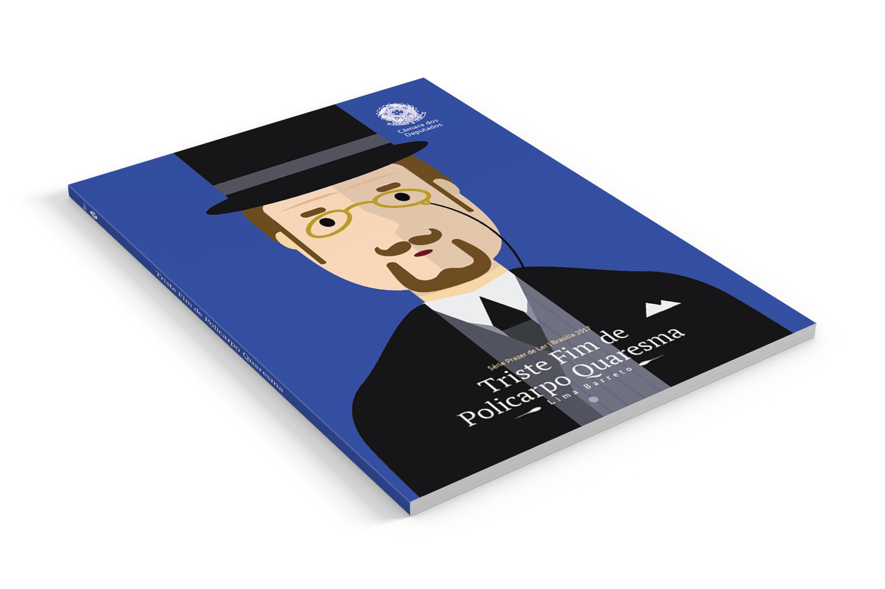
The book Dom Casmurro is a work that fell in the public domain and the Chamber of Deputies created a series called "Pleasure to Read", before this series had a somewhat old visual identity and Edições Câmara wanted to have a rapprochement with the younger audience , One of the problems was, we could not use images from the image bank because it would not bring the essence of the work and when we wanted to draw we were afraid to create a drawing style that was very marked and only one person on the team could do.
When designing a character using flat design as a base, we allow everyone on the team to develop characters for other works using the same aesthetics, proportions and colors.
A new proposal for this project was to create a new typography for the work so that we could transmit this younger face to the project. The typographic family was the fira sans of the mozilla foundation, it is a source of the sans serif type and of live use.